

CLIENT | The Medi-Collective
WELLNESS
COLLABORATION
EFFECTIVE
coming together in care.
The Medi-Collective (TMC) is a multi-disciplinary group of medical practitioners dedicated to applying a collaborative working model with the goal of effective physical and mental community healthcare and Positive Wellness.
The Locations.
TMC now has 6 locations throughout Ontario and is accepting new patients. We have had a lot of fun working with their team to design the interior and exterior signage for each of the locations.
The brand.


IT’S ALL IN THE NAME
Working with the client we came up with a name that is a coming together of their medical practice and people.
The use of a legible, bold type (Gotham) reflects their goal of clear communication and visually expresses our personality and character; current, trustworthy, functional, familiar and progressive.

JOINING PRACTICE AND PEOPLE
The Hyphen- def: A mark of punctuation used to join or connect.
Along with literally connecting the words Medical and Collective, the logomark represents the collaborative healthcare they practice.
The mark visually expresses their combined medical practice with a coordinated team of practitioners whose end goal is to provide comprehensive, cooperative healthcare outcomes.
Brand Guidelines.
BEST PRACTICES
Developing the brand voice and best practices for the brand, HB built a beautiful Brand Guideline for the company to use as a baseline for all applications of the brand in the real world.
<< Click on the image on the left to see the full brand book.
The Website.

CHECK IT OUT TO SEE WHAT CLINICS ARE OPEN OR OPENING SOON!
Social.
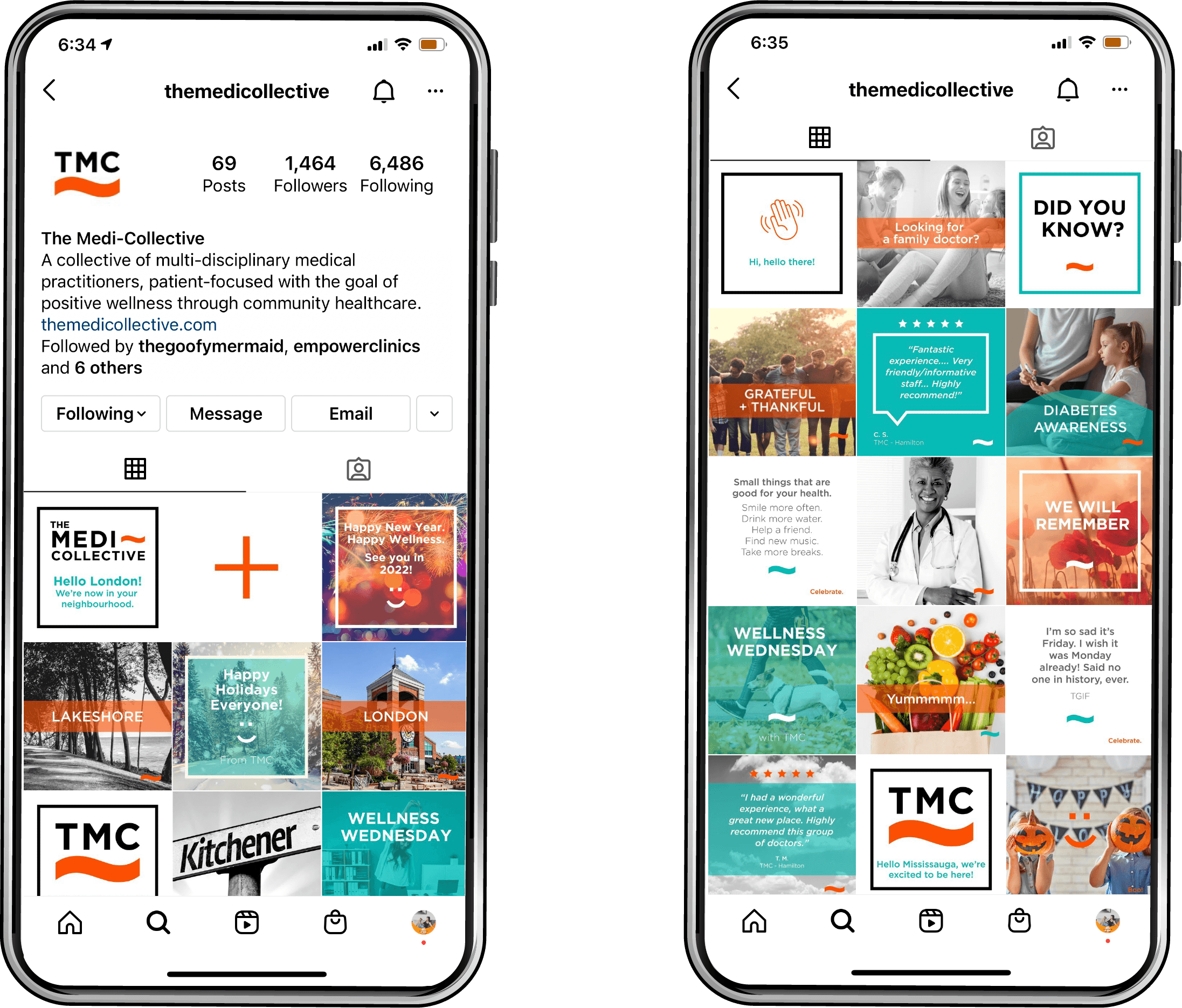
A fun informational social and marketing voice that reflects both the brand and industry they represent.
@themedicollective