
CLIENT | Kai Medical Labs
We worked with Kai Medical in Dallas Texas to rejuvenate their brand personality and introduce effective communication strategies; including visuals to voice, packaging and social media.
Kai required the ability to speak to their audience about diverse topics in a variety of ways.
When developing the brand it was important to express the character and personality of the company, one that is based on and reflective of the top leadership and integral to the company’s values and purpose.
We are happy to still be collaborating with Kai managing, guiding, and growing their brand.
How does your brand voice sound?
The KML Brand
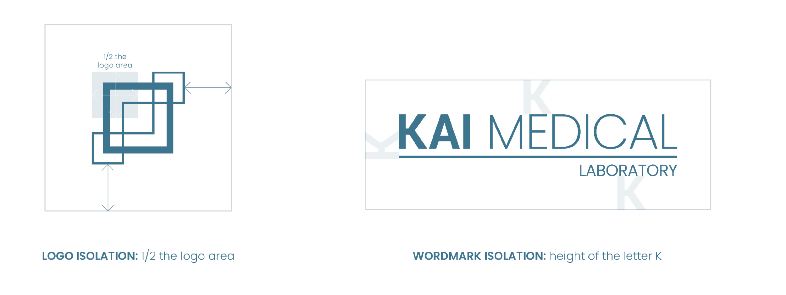
THE LOGO
Kai had a fairly good rationale behind their original brand visuals. We wanted to keep those and the brand value that they had already established. So we didn’t stray too far from the original design and essentially did a soft refresh to the brand.
The logomark is an abstracted rendering of an RNA molecule, an essential part of all known forms of life.
We chose square designs as they best represent stability, strength, organization.
The lattice represents the importance of teamwork, collaboration, and positive relationships that are the framework of the company.

THE WEBSITE | Mobile + Desktop +
The website first and foremost needed to be functional; from a user experience perspective and a content management one.
Once we create an effective framework we then apply the brand across it, visual and voice. Cohesively aligned with the greater brand vision.
We continue to support Kai’s web needs on an ongoing basis.
The Kai Care Brand

THE VOICE
Knowing is caring.
The reason behind medical testing is to gain the knowledge that best informs good decisions around caring for ones health and wellness. Therefore knowing is an essential part of caring.
THE LOGO
Kai Care is the second part of the Kai Medical brand and speaks for the direct-to-consumer product lines and concierge services. As such, we wanted to pivot from a technical focus to one that reflects the more personal, less formal side of the brand. At the same time remaining well-grounded in the professionalism of the medical space.
For brand unity across the two areas, we kept the fundamental design in place while softening the edges and brightening the colour for a more personal design.
COVID-19 | INFLUENZA A/B
AT HOME SALIVA TEST KIT
The first package design we did with Kai holds true to our multi-pronged voice approach to their communication. Function and personality. Communicate the informative, unambiguous side of a medical test kit while at the same time presenting it in a way that speaks to the user in a more personal, caring way.

WEBSITE
A simple clean design was applied that ties in with both the brand and the voice of the company.

Social Media
A basic style direction and template was developed to help support the main brand.